WE HAVE A NEW LOOK AND A NEW LOGO!
2015 marks an exciting moment in the growth of the IAC. We are unveiling a new, re-energized logo and brand system, representing the best of the history we've made and the powerful future we will create together.
Our motivation for this change is simple. We want our brand to reflect our organization and its ethos: the IAC is the largest aerobatic club in the world. We are pilots with exceptional skills, dedicated to educating and inspiring others. We deserve a brand that makes us proud.
BRAND GUIDE AND ASSETS
Click here to download the IAC brand guidelines and logo assets
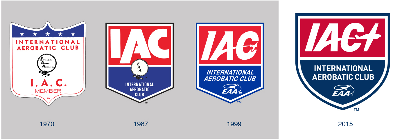
MAKING OUR MARK SINCE 1970
Founded in 1970, the IAC has continued to evolve over the years and our logo has been regularly updated, first in 1987 and again in 1999. 2015 brings more change. With a new president and a new board, the IAC continues to move onward and upward with new energy to improve what's working and fix what's not.
The IAC's first logo was a classic shield. The shield-shape is a foundational element that has been retained through all of the updates. Our new logo trades in the dated, square, 80s-style shield for a more classic, heraldic form. The letterforms have been modernized and simplified so that the monogram and font are related and the airplane icon has been enlarged to bring our core commitment to aerobatics to the forefront. The new logo retains strong equity with earlier logos but updates colors, forms and iconography to honor our heritage and speak to the IAC's unlimited potential for growth and evolution.
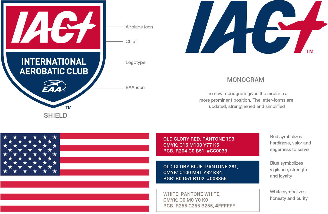
THE ELEMENTS AND THEIR MEANING
The shield is a symbol of resilience. No matter what gets thrown at us we are able to stand fast and succeed.
The division of the shield (party per fess) into two horizontal fields signifies rule and authority. The top panel is called a 'chief' and contains the dominant blazon or monogram.
The abstract airplane icon in the new monogram represents optimism and the potential for change and discovery. The arc of its flight is a journey into the unknown, overcoming risks and achieving a new level of knowledge.
Red, white, and blue are the colors of our flag, representing the national values of loyalty, valor, and strength. Our new IAC colors match our country and our national trade dress. Old Glory's colors will never fade.
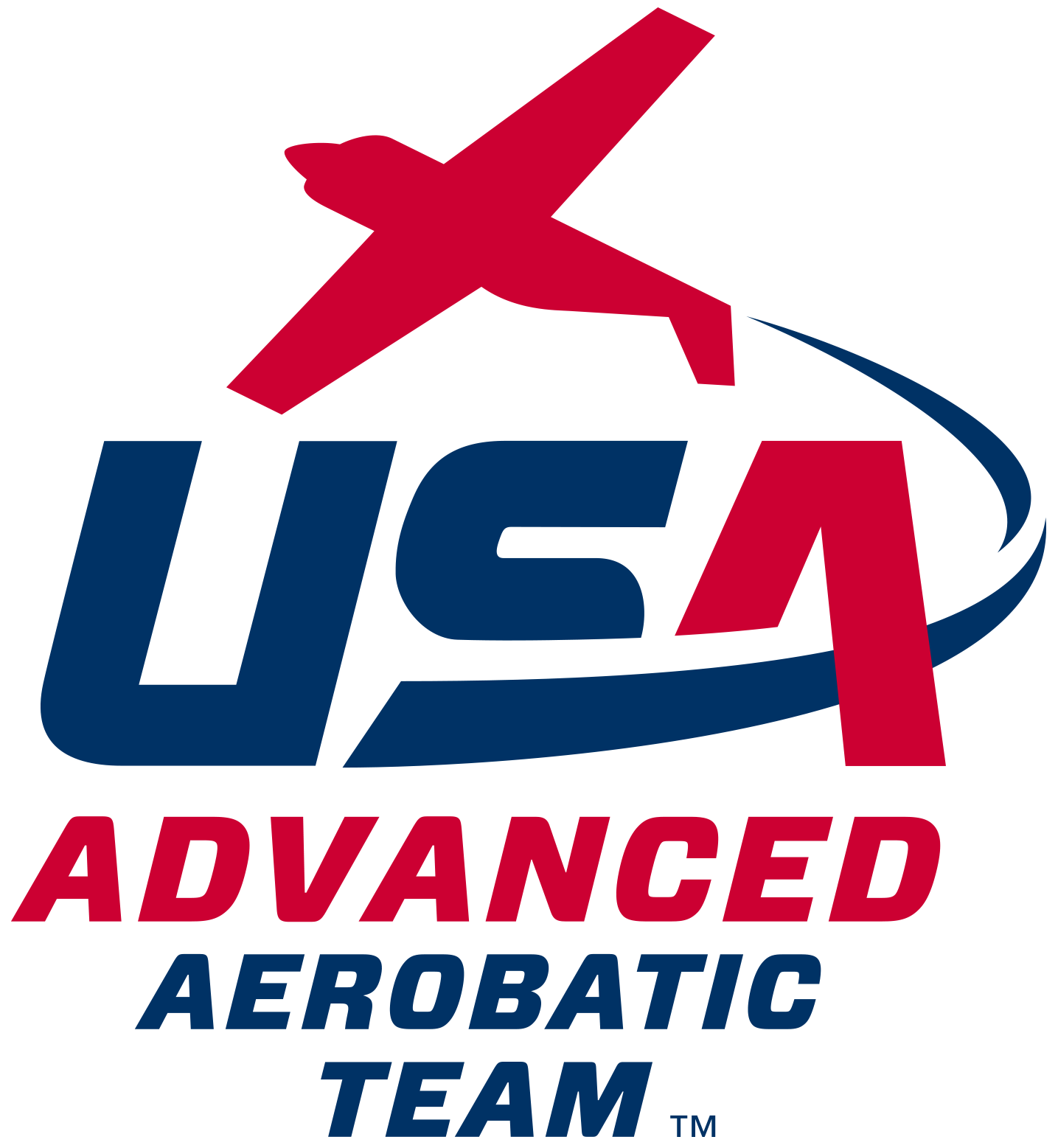
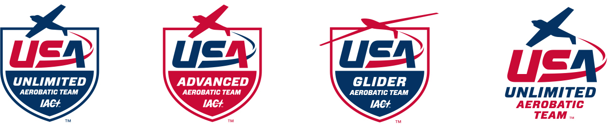
THE TEAM LOGOS
Like Red Bull, Ducati Corse and Ferrari Formula One, the IAC's competitive aerobatic teams are an exciting and prestigious demonstration of the IAC's central role in US aerobatics. While the teams functioned independently of the IAC for many years, 2015 marks a new commitment to embrace our flying spirit and support our most talented pilots in national and international competition. Including the new IAC monogram in our new team logos is a visible manifestation of that support. Each team logo has two forms, contained in the IAC shield, and as a stand-alone logotype.
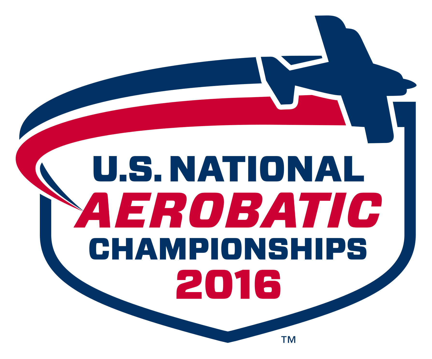
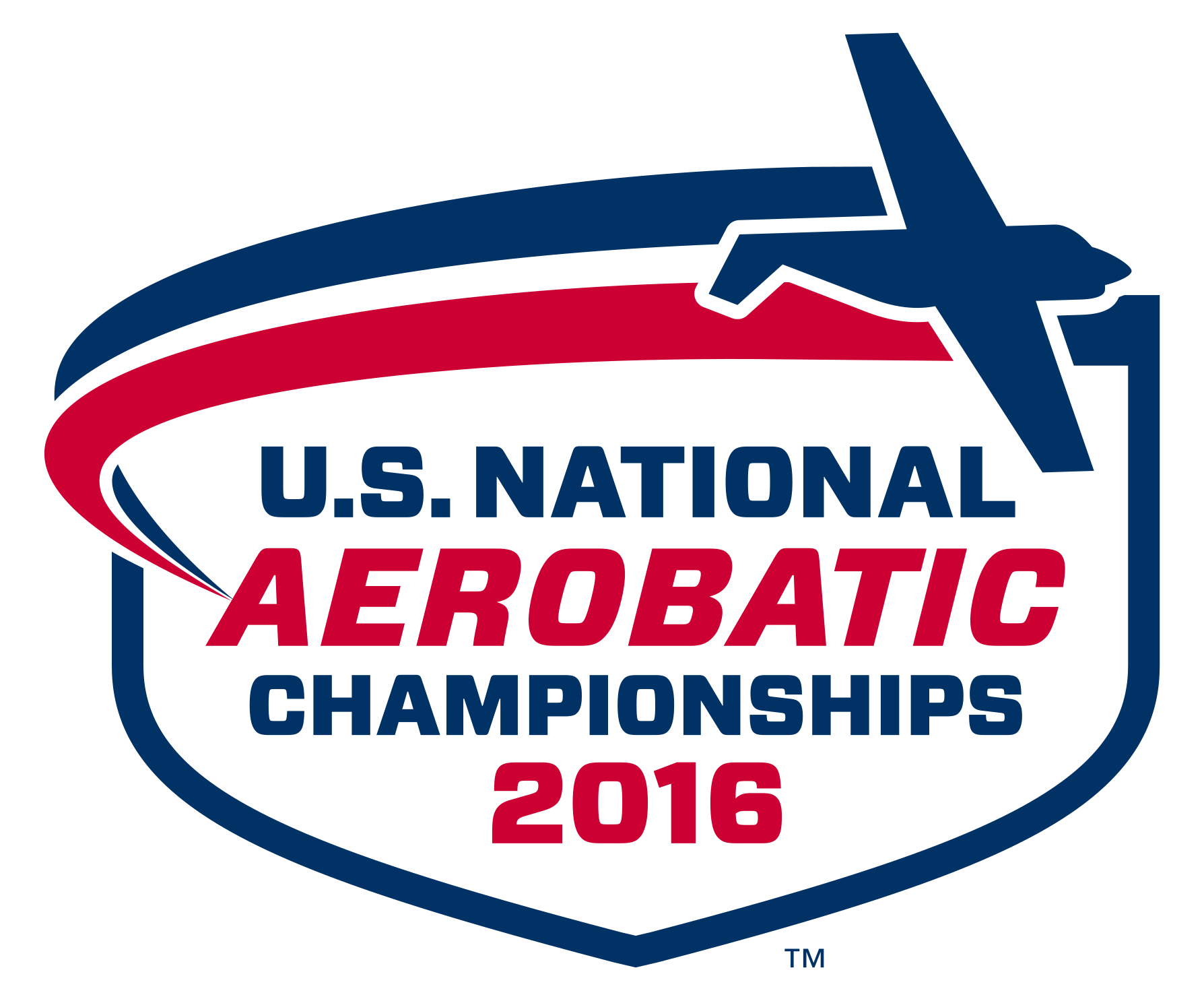
A NEW LOGO FOR NATIONALS
The US National Aerobatic Championships is the IAC's premiere annual competition event. Commonly referred to as "Nationals", finishing placement in this competition determines selection for the US Unlimited and Advanced teams. The new logo for Nationals has strong visual connections to the IAC brand, using the same colors and shield containing shape. There are two interchangeable versions of the extractable airplane icon, one with a monoplane and one with a biplane.
ONWARD AND UPWARD
It's blue sky and a fresh start. Our new brand family will help us make our mark as a sport and as a brand. Used consistently, these logos will tie our organization, teams, and events together and present a confident and consistent face to the world. Onward and upward. We are excited and proud to be part of this journey.